Ocularity
This post is about an experiment I'm doing. Please follow the link and have a go. The purpose of the experiment is to measure what colours humans can distinguish. This post explains my experimental design in more detail, and compares it to previous work.
My motivation is to find a way to represent colours efficiently. The representation needs to be precise enough not to make any colour errors that a human can see, but it should avoid representing distinctions that a human can't see. A colour representation with these properties is useful for image and video compression.
My experiment
After a short introductory questionnaire, the experiment shows you pairs of images similar to these:
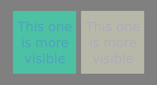
and asks you to click on the one where the text is more visible. Given a few thousand such answers, from a representative variety of experimental subjects, I hope to train a simple model to predicts how similar two colours are.
The questionnaire
I choose the twelve questions off the top of my head, with a bit of googling for previous studies to see if I should expect any significant correlations. Here's what I expect:
-
Age: We might expect older people to have have worse eyesight.
-
Sex: A minor effect, apparently.
-
Eye colour: A minor effect. People with blue eyes are slightly better at discriminating colours, apparently.
-
Colourblindness: A major effect. Typical people can distinguish everything that a colourblind person can see, I think, but the reverse is not true. I need to ask this question to train my model correctly (on typical people only). It might be interesting to train models for the different forms of colourblindness too.
-
Eyewear: No expected effect, except if somebody is nuts enough to wear sunglasses while doing the experiment.
-
Eye surgery: Cataract surgery might have a minor effect.
-
Surroundings: Lighting and visual background should have an effect. Since I am crowd-sourcing my data from random people on the internet, I have very little control over these factors. These two questions are an inadequate attempt to capture relevant information. Ultimately I will be averaging over the unknowns.
-
Alone: I don't think it will matter. It might indirectly measure how distracted the user is, or something.
-
Device: This is a proxy for how far away the screen is from the viewer, and for how much of the visual field it occupies. I expect some effect.
-
Screen: Old screen technology reproduces colours quite poorly, especially if viewed off centre. Different technologies differ in how black they can go. I'm not including any very saturated colours in my experiment, so the colour gamut of the screen is probably not important. Depending on whether I detect significant differences, I might choose to filter out users with bad screens.
-
Monochrome: Obviously important! I will filter out results from anybody doing the experiment in black and white.
The images
The two images are generated independently and from identical distributions. For each image, I pick one of 35 colour centres, one of 6 colour deltas, and one of 10 magnitudes. The total number of possible images is therefore 2100.
The 35 colour centres include the union of a 3x3x3 grid and a 2x2x2 grid, forming a body-centred lattice in the sRGB colour space. Together they include 5 equally spaced greys and dull versions of all the rainbow colours, as well as pinks, browns and a number of others. The sRGB colour space by no means covers all colours that humans can see; not even the saturated colours of the rainbow. However, it does include many of the colours that occur in practice, and I can be fairly confident that these colours will be displayed roughly correctly on whatever screen the user is using.
The 6 colour deltas connect opposite edges of a small cube in the sRGB colour space. I have distorted the cube a bit to make the different deltas roughly equally perceptible. Specifically, I have squashed the cube by a factor of 10 in the black/white direction, because humans are much better at discriminating luma than chroma. Six deltas are necessary and sufficient to fit the six parameters that define a colour discrimination ellipsoid.
The 10 magnitudes are -5, -4, -3, -2, -1, 1, 2, 3, 4 and 5. Presenting the user with different magnitudes of colour difference will hopefully allow me to quantify the visibility, e.g. to say that some difference is three times as visible as some other difference. Including the negatives means that sometimes the foreground and background colours will be swapped; I will be surprised if this matters, but it is worth including.
For gory details, read the source code.
Similar experiments
Many similar experiments have been done in the past. A list of highlights, complete with the experimental data, is here. So why not just use this data?
Most of this data is unsuitable for my application. The most common failing is that it is restricted to two dimensions of the colour space; it does not constrain all six of the parameters that define an ellipsoid. Many of the experiments are designed to measure variables such as hue and lightness that are irrelevant to my application. Furthermore, in the write-up of their experiment, Luo and Rigg express some scepticism about earlier data sets.
Rather than try to understand and adapt the earlier data, it feels easier and more reliable to repeat the work and to make exactly the measurements I need. This will also serve as a cross-check on my understanding and on the reliability of the data. The downside, of course, is that I am an amateur and there's a good chance I will mess it up. But let me try!
Colour spaces
A 3-dimensional colour space is sufficient to represent colours as humans see them. The XYZ colour space (also known as CIE 1931) is the canonical and historical example. Each of the X, Y and Z coordinates is a linear function of the spectrum of the light. Colours that are indistinguishable by humans have the same coordinates, and colours that humans would consider different have different coordinates. In particular:
-
Ultraviolet and infrared light, being invisible to humans, have the same coordinates as black.
-
Sunlight has the same coordinates as a suitable mixture of primary colours.
-
Some coordinates correspond to "imaginary" colours that are physically impossible to make using light of any spectrum, but which humans can theoretically see.
Uniform colour spaces
A perceptually uniform colour space is one where distance in the space approximates the human-visible difference between two colours. A perfect uniform colour space would be an ideal way of representing colours efficiently; by storing all coordinates with the same precision you could represent all necessary information and nothing else. You have probably already guessed that a perfect uniform colour space is impossible.
CIE 1931 was never intended to be a uniform colour space. For this application it has two main flaws:
-
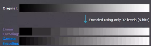
The precision needed to represent a visible difference in dark colours is overkill for bright colours. This reflects physical mechanisms such as dilation of the pupils, and saturation of the retinal pigments. It is what allows humans to see in the shade as well as in bright sunlight.
-
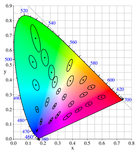
The discrimination ellipses are nowhere near circular, such that sufficient precision on one axis is overkill on another. Moreover, their shape and size depend on the colour.
The first of these problems is solved well for monochrome images by gamma-correction with γ = 3. Black and white analogue television uses this method (with γ = 2.2) to improve the signal quality for a given transmitter power.
For colour images, a popular approach is to apply gamma correction to the individual primary colours. Examples of colour spaces which take this approach (with various values of γ) include sRGB (which I use to generate random images for my experiment) and newer standards designed for HDR television. It is also the approach used by the Oklab colour space. Though this is indeed a simple solution to the first problem, it makes the second problem worse.
Better attempts at a perceptually uniform colour space include the Luv colour space and the Lab colour space, both defined by the CIE in 1976. The subsequent battle between these standards is known as the L-star wars. Their flaws were soon afterwards discovered. A recent rather complicated attempt is Cam16-UCS.
All these colour spaces, and mine, are ultimately defined in terms of the XYZ colour space.
Beyond colour spaces
To model colour differences accurately, a uniform colour space is not sufficient. If you think of human color discrimination as a metric on the colour space, you find that it is a curved space. Unsurprisingly, I have not seen anybody attempt to define such a colour space. Instead, increasingly complicated formulae have replaced the Euclidean distance metric, without changing the colour space (typically Lab).
However, this way of improving the accuracy of the model is useless from the point of view of representing colours efficiently; it's no use merely being able to measure how much data you've wasted. I won't consider this approach further.
Better color spaces are possible
Indeed, better colour spaces exist, but they are conceptually and computationally difficult. I think it must be possible to get most of the improvement in uniformity with much less complexity. This approach is especially tempting since perfection is impossible anyway.
The luminance coordinate (the L shared by the Lab and Luv colour spaces, or the Y of the XYZ colour space) is intended to represent the human-perceived brightness of a colour. Way back in the early 20th century it was pragmatically decided to define "luminance" as a linear function of the spectrum of the light (modulo gamma correction). However, there is good evidence that perceptual brightness is actually non-linear even as a function of chroma alone. This is low-hanging fruit.
The colour spaces that gamma-correct the primary colour components separately all share the same non-uniformity: the discrimination ellipses are stretched out as chroma (saturation, non-greyness) increases. This is low-hanging fruit.
Historical colour models that predate good computer graphics (about 1995) suffered a handicap: they were aimed at a more difficult problem. The more difficult problem is modelling the colour reflection or transmission. Applications included quantifying the colours of paint, ceramics, textiles, and glass. In that context, it is necessary to worry about the illumination conditions. When applied to radiative colours (e.g. computer displays) the "illumination" is a defined constant. This is low-hanging fruit.
My proposed model
At the time of writing, I have not determined the twelve parameters of my model; that's what the experiment is for. So it is vapourware, and you should check back in a year or two to see if it went anywhere.
My model is a uniform colour space conceptually similar to Luv, in that it applies gamma correction to the overall colour, and not to the individual primary colour channels. It improves Luv by using a quadratic formula for luminance.
My model is similar to Oklab in that all its parameters will be determined by fitting experimental data (infeasible in 1976!). It differs from Oklab in that mine is intended to be perceptually uniform, whereas Oklab is intended to be perceptually orthogonal (so that blending colours works well).
Unlike CAM16, I won't construct my model by piling tweak upon tweak until I've fixed as many problems as I can find. I will restrict myself to a simple, invertible formula, comparable in complexity to Oklab, and I will push it as far as it will go.
The forward transform
Let me describe the steps to transform CIE 1931 XYZ coordinates into my UVW colour space (not to be confused with the obsolete similar-in-spirit CIE 1964 colour space).
Luma
Define Luma L using an arbitary quadratic formula:
L = √((X Y Z) M₁ (X Y Z)ᵀ)
where M₁ is a symmetric 3x3 determinant-1 matrix (five parameters).
This definition is general enough to include the CIE 1976 definition of luminance as a special case. However it also encompasses the simplest possible non-linear definitions, in the hope of making an improvement.
Gamma-correction
Compute the non-linear L* by applying a transfer function to the linear L:
L* = ³√(L + Lₙ³) - Lₙ
where Lₙ is the perceptual luminance of the "noise floor": the threshold below which perception of luminance becomes linear (one parameter).
My choice of transfer function differs from other colour spaces. I claim mine is a bit simpler. However the choice is otherwise not important; the difference between different transfer functions is not the biggest source of inaccuracy in the models.
For a given chrominance, i.e. when comparing different intensities of light of the same colour, L* is supposed to be perceptually uniform. Comparing the luminances of different colours is not directly relevant to my application, and using my formula to do so is probably not sensible.
Adapted coordinates
Compute the adapted coordinates X*, Y*, Z*:
(X* Y* Z*) = (L* / L) (X Y Z)
This step is included to mimic the change in sensitivity of the human eye under different lighting conditions. Note that it is a non-linear step, because L* is non-linear.
Perceptual coordinates
Compute perceptual UVW coordinates by applying an arbitrary linear stretch:
(U V W)ᵀ = M₂ (X* Y* Z*)ᵀ
where M₂ is a symmetric determinant-1 matrix (five parameters).
This step is included to model the different sensitivity of the human eye to different colour deltas.
The inverse transform
All steps are easily invertible:
    (X* Y* Z*)ᵀ = M₂⁻¹ (U V W)ᵀ
    L* = √((X* Y* Z*) M₁ (X* Y* Z*)ᵀ)
    L = (L + Lₙ)³ - Lₙ³
    (X Y Z) = (L / L*) (X* Y* Z*)
Euclidean distance
Define the distance ΔE between two similar colours to be proportional to the Euclidean distance between their UVW coordinates:
ΔE = k √(ΔU² + ΔV² + ΔW²)
where k is an arbitrary scaling. A common choice is to choose k so that the radius of the minimal discrimination sphere is about 1 (one parameter).
Acknowledgements
Thanks to Martin Keegan for teaching me how to write a web server in Rust, and to Reuben Thomas for helping me with generating the images, the HTML and CSS, the server admin, testing, proof-reading, and general moral support. Much appreciated!
Last updated 2026/03/16